Today, Apple released two new beta previews of their developers. We will cover both of the previews in separate articles today, with this article dedicated to all that was included in the developers preview for developers on OS X Yosemite.
The new preview includes a ton of new additions and changes that are a welcome sight and not exactly mentioned or hinted at the WWDC (Worldwide Developers Conference) a couple of weeks ago. The features and additions in this new beta preview are mostly feature or UI based, meaning that for those who care about what’s under the hood, you may not be all too excited. However, for the user who will ultimately enjoy the outward changes, it is a bit of a nice surprise or deviation from the OS X norm. Here are a couple of the changes outlined below.
The Overview
![]()
To start, we already know that the face and design of OS X Yosemite is certainly taking an ode to the design that was debuted in iOS 7 and continues to reign in iOS 8. This is not only as a way to make for a modern, minimalistic look that we have come to expect out of contemporary software for today, but also as a way to represent the unification of iOS and OS X that is the hallmark of both Yosemite and iOS 8. With current OS X Yosemite beta versions being seen as too volitive for even the beta testing public, Apple is expected to release their seeding program for those who signed up, to the public in a couple of weeks.
The Face

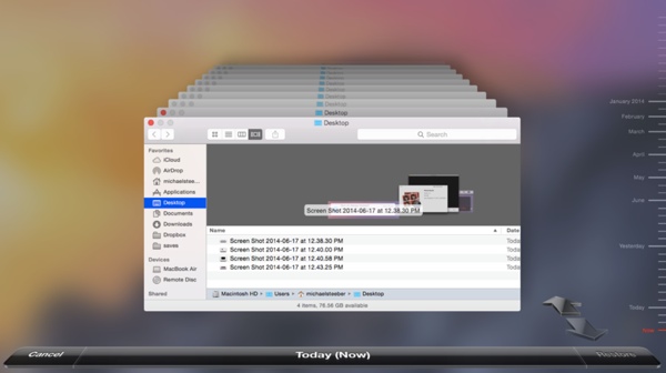
The beta version includes a couple of interface changes in various departments. To begin, when you activate Time Machine in OS X Yosemite, the interface background will now be a blurred version of your current desktop background. In addition, to the right, you will be able to toggle how far behind you want your Time Machine results to show. From “Now” to “Month, Year”. The “Settings” icon now has a much needed facelift. I predict that we will see a couple of new icon updates in the coming weeks.
The Features

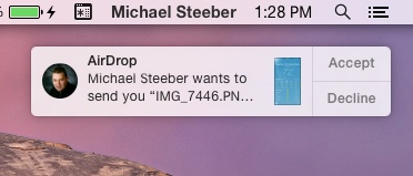
In the department of features, the latest beta shines a little bit more. There is an updated but still minimalistic Photo Booth in OS X Yosemite beta. You can also block Screen Sharing requests, a great way to combat individuals who are a bit of a nuisance. In the department of notifications, you can now receive a notification about an Airdrop file receiving request regardless of where you are on your Mac.
In the past, we had to go through the arduous task of going into AirDrop, ensuring it is activated, waiting for the individual to get in our distance, and once they popped up click to accept their file share. This could possibly hint that AirDrop continuously is at work when activated, rather than requiring the activation of a Finder window.
Other Features We Know
All of these features are in addition to what we already know through the WWDC announcement, including UI changes to Safari, improved speed, searching improvements in both Safari, Spotlight, and Finder, along with a couple of other features. Messages, currently not fully useable in beta, allows you to not only receive iMessages, but simply any message that your phone receives, this includes SMS and MMS messages.
Coupled with the ability to also make and answer calls on your desktop, OS X Yosemite is working toward preventing you from having to be behind both your iPhone and Mac screen at the same time. Your iPhone can rest and charge while you are at work on your computer. More about OS X Yosemite can be found in our WWDC review and on future beta release round-up articles.
Disclosure: We might earn commission from qualifying purchases. The commission help keep the rest of my content free, so thank you!


