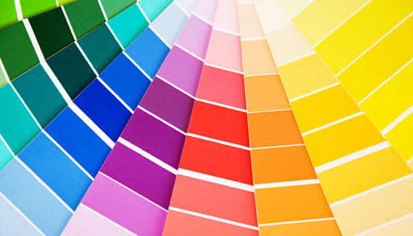
Blogs often make a strong impression on a viewer before he or she even starts to read an article and judge you as a writer! Of course, there are plenty of factors that make up this impression: domain name, number of ads, and more, but one of the major factors in these first impressions is the color scheme of your blog. Additionally, your color scheme can also play a big part in helping current readers to focus on your content and to understand the personality and message that the blog is trying to convey. Follow these tips to make sure that your blog’s color schemes works efficiently and conveys what you want it to!
Different Colors Have Different Meanings
Here are some of the main colors that web designers use on their blog themes, and the messages that they convey – the feelings that are generally associated with them. It is important not to mismatch colors and blogs – example, for a blog about baby showers, don’t use black with menacing red and lime green claw marks.
Red: Stop, passion, energy, blood
Orange: Warm, bright, youthful
Green: Natural, fresh, safe, money
Blue: Sophisticated, calm, relaxed
Purple: Royal, magical, luxurious, feminine
Black: Seri0us, sleek, threatening
Brown: Earthy, basic, down-to-earth

Which one of these colors would really fit your blog the best? Make sure that you think about the kind of feeling that you want to come across when readers first visit your blog.
Thinking About Your Readers
We’ve all been on a site that isn’t necessarily bad, but that we left because the text and background color combinations were not very easy on the eyes. Generally, for body text, you want to stick with black. I can name very few sites that I find comfortable to read that do not have black body text. Some bloggers will argue that black background with white text is just as easy to read, and I happen to agree with them, but some people dislike this color combination and prefer the classic black on white layout. For this reason, I would encourage you to keep your body text simple and instead play around with other font colors.
Links
Links should either be a generic blue or should match your blog’s color scheme. Though you love the “pretty colors” that brightly adorn the outside edges of your site, people need to be able to read links, so it’s best if you dumb down the vibrance in these colors. (For example – neon links are a bad idea – dull colors usually have better click through percentages. By dull, I mean not blindingly bright and very easy to read on a white background.) Again, if you’re in doubt, go with a blue color, because case studies have shown that this is generally a safe bet.
Heading Tags
Chances are, you use heading tags a lot in your posts – they’re good for SEO, and they’re good for making your stellar content more readable. There are, again, two ways you can go here. You can take the path of making these tags the same color as your text, or the path of making them match your blog’s color scheme. If you take the latter path, then be sure to make these tags readable – it would probably make sense to have them the same color as your links.
Basically, when you’re choosing colors for your blog, the key isn’t to pick the most attractive colors, though it is nice to do so, but to make your blog easy to read. Readers are not going to stop visiting your site because they don’t like the dull orange color you’re using, but the will stop coming if you have green neon text on a white background complemented by a bright red sidebar. Play it safe, and make sure that readers’ eyes are not strained!
Disclosure: We might earn commission from qualifying purchases. The commission help keep the rest of my content free, so thank you!


PrIyAnGsHu @ Make Money Online says
Wow, awesome article Jack ! The color of of a blog ultimately reveals us about what it is all about. A great post dude :) !
Becca says
Color also reflect the feeling of author and the content of the site. people would keep coming back to a site that is good to eye while reading the content.
Kyle Kam says
It’s all about your reader’s reaction to your color scheme. It’s important to know, what colors are appropriate for the eyes of your readers. As a reader, I appreciate light colors with relaxing effects for the eyes, it’s the scheme that makes me hungry to read more.