There’s a growing technological trend of imitating what’s already available in the market for consumers, and some would try hard to differentiate their brand by bringing enhancements to existing features. Such is the case of Dropbox’s new editing software designed to take on Google Docs.

But can Dropbox’s Paper, as it is simplistically called, overthrow Google Docs? Or at the very least provide an alternative service in the collaborative software niche?
Let’s look back on how Paper started. In early 2015, Dropbox unveiled Notes, a beta software for collaborative tasks that resulted from Dropbox’s recent acquisition of Hackpad.
Paper is designed with simplicity and ease of use in mind, especially for desktop users. Unlike Microsoft Word’s cumbersome set of menus and toolbars above the window, with its ungainly look that frightens some users, Paper shows only a plain white page as you start. There’s a blue button that prompts users to “create” a document, and everything else follows very well, you only have to click on the commands.
At the beginning of your document, the workspace is free of any types of formatting. Start typing and you can begin to transform and format your texts into various parts of the document such as title (or headline as Paper labels it), a list or a set of things to do. All you need to do is highlight certain words in order to format them. Strangely enough, there’s almost all of the MS Word formats, except the italics function.
On the multimedia side, Paper enables users to embed videos, mp3 files, photos and other media forms in the document by simply pasting the link. That is particularly helpful to groups of users who are working as a team, and the rich media management feature is an added attraction.
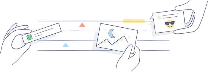
In terms of collaboration, Paper works in much the same way as Google Docs, where you can share your document to a friend or workmate by sending the auto-generated link to them. Then you as the owner of that document can decide what privilege to give them: comment-only or editing permission. There’s also a bubble located at the right of the page, where a space is provided for your comments, which you can enhance with some nifty stickers to add flavor to your message.
While this is all true for the desktop mode, some early adopters have encountered hiccups with the mobile app, and Dropbox promises to be working on the issue already. That is understandable for one reason, the mobile version is a beta edition and Dropbox is developing still the full version, which it hopes to launch soon.
Disclosure: We might earn commission from qualifying purchases. The commission help keep the rest of my content free, so thank you!


