New images show how the new iOS 7 looks on iPad. It is very surprising and yet very interesting to note that Apple has changed the default layout of the new features on the iPhone and iPad. This is a great move from Apple, utilizing the true power of iOS in a much more sophisticated way.
iOS 7 look and feel
Majority of the new features introduced in iOS 7 remains the same. The control center stretches from one end to another at the bottom and the new flat UI surface of icons just like we saw at the WWDC. But the control center on the iPhone is much larger than the one shown for the iPad. On iPhone, it takes about half of the screen when swiped up from bottom.
The images shown are actually taken from the iPad simulator from the Apple’s Xcode running on Mac OS X. Apple actually didn’t provide a demo for the iPad version of iOS 7 mainly because they are still working on it. And yet we can see from the demo shots that it is like the iPhone version of iOS 7 being stretched for the iPad.
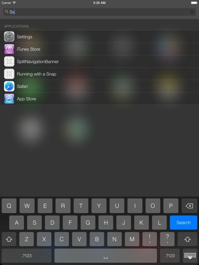
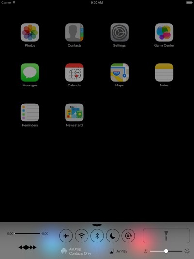
But there are few noticeable changes again that differs it a little bit from the iPhone. Some of the app icons are way different than the ones we see on the iPhone and this gives us a little hint at what Apple might be planning for the iPad version of iOS 7.
The iOS 7 looks cooler on the iPad because of the bigger screen size and emphasize on smaller details make it very attractive and yet very simple. The keyboard layout, different windows and frames, font style all contributes to a better looking iOS 7.
Safari on iPad also gets a new design with the navigation url bar placed right at the center on top of the browser, giving easy access to the user.
We are yet to see the official iOS 7 looks for the iPad and we are sure that Apple will soon show the images once they are finished refining it for the iPad. Till then, enjoy the simulator pictures and imagine how would you feel when you get iOS 7 on your iPad.
Disclosure: We might earn commission from qualifying purchases. The commission help keep the rest of my content free, so thank you!



Victoria says
The update looks great, but the most important question for developers is if the apps will require major updates to be released for iOs7
Osei Fortune says
IOS7 looks really nice can’t wait to get it but don’t like the fact it looks like a mixture of Android and Windows 8 oh well Apples famous for taking someones else design and making it better :D
Gowtham V says
Some people say IOS 7 Doesnot look good due to the simple flat design like that of microsofts windows phones.
I like the look a lot though. Its that apple makes it perfect everytime even though the flat screen design already exists in lumia , apple just made the best of the Mobile OS with the IOS7