You are fast at work, either behind a computer or with customers, and you get a notification either while working or on a break. You take the time out to check to see what the update is, only to find out it is either junk mail or an unnecessary message. Now that your train of thought is out of whack, you are left a little angered that you wasted your time and concentration.
iOS 8’s concept of ‘Blocks’ could possibly change that. Jay Machalani’s blocks concept is designed to allow individuals to simply pinch to preview an application, all without having to truly open the app fully. Today, we will take a look and feature Machalani’s design concept.
More about Jay Machalani
Joseph Machalani is a Montreal-based “UX/UI & Branding Architect”. In other words, Jay, as he prefers to be known as, takes into consideration how individuals connect emotionally and subconsciously with their devices when making design decisions. This explains what brought him to come up with the ‘blocks’ concept in the first place. You can take a look at some of his other work, however today we will focus a little bit more on Machalani’s latest design concept, blocks for iOS 8.
Jay disclaims in the beginning of his article detailing his research and analysis process of the blocks concept that it isn’t a working prototype for others, simply one he “built from scratch in Adobe Fireworks CS6 and rendered in Adobe After Effects CC”. It is not one that is rumoured to be in iOS 8 or one even under consideration by Apple.
The ‘Blocks’ Concept
Machalani isn’t a basement UX thinker, his concept for Windows 8 eventually sparked Microsoft to make a couple of changes of their own. Jay mentioned in his research that the release of iOS 7 was one that was with disappointment due to the lack of seriously changes that occurred outside of design tweaks. Outside of the iOS 6 and iOS 7 distinction, Apple has played it safe with the home screen since the invent of iOS. Rows have stayed, Apple added the ability for people to add a background in iOS 4, along with folders and multitasking. But since then, much hasn’t changed with the home screen.
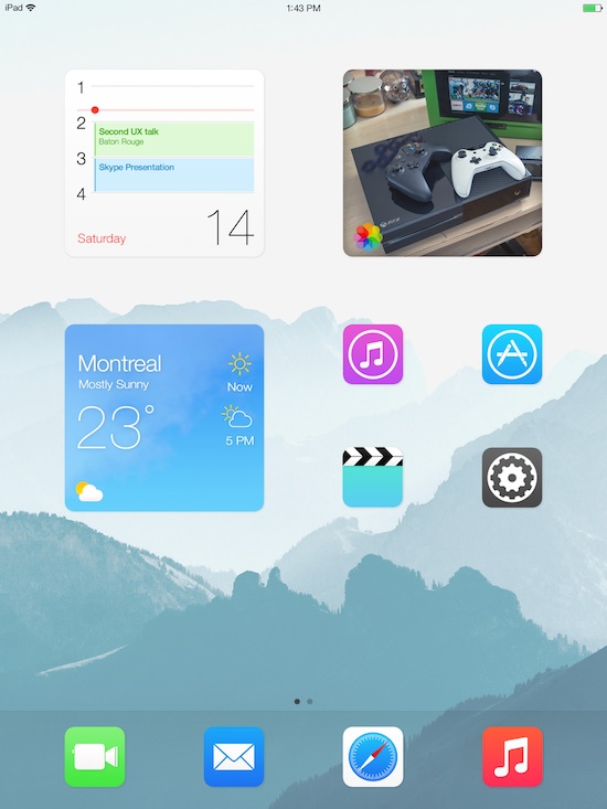
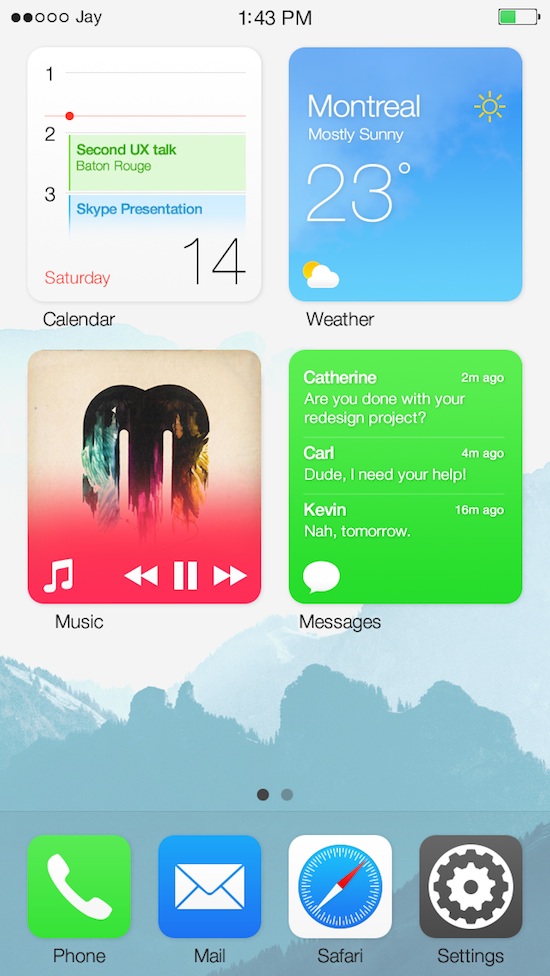
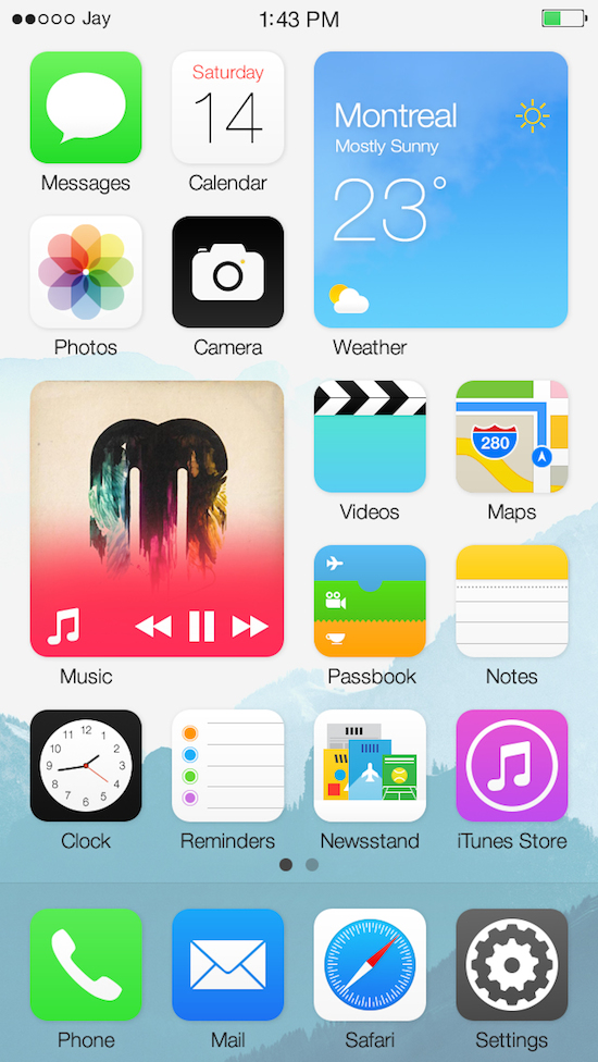
In addition to the pinching effect that Jay is presenting in this concept, he is also making the icons pinched into a widget on the home screen. This, in essence, makes the selected application fully accessible directly in the widget itself. This makes checking the weather more seamless, music can be interacted from the home screen, not just Control Center, and this is all while retaining the minimalistic Apple feel that was introduced in iOS 7.
Sample Photos and a Video
Below, we have a couple of sample photos that show off the Blocks concept.
Here is a bit about how it works from Machalani:
On your iOS device you have your list of icons like you know and love. They work and look the same way as before. But, if you want more information about an app, you can simply pinch the app icon bigger and it will now become an iOS Block. You literally make the icon bigger with your finger if you want more; it can’t be simpler and more intuitive than that.
Would Apple take the steps Microsoft took with the Windows 8 concept and look into implementing Machalani’s designs into iOS 9? Only time would tell, however with the experience that Jay has, it isn’t a far fetched prediction. Let us know in the comments below about how you feel of the mockups created by Jay Machalani.
Disclosure: We might earn commission from qualifying purchases. The commission help keep the rest of my content free, so thank you!


