Chances are, you heard about a new Myspace overhaul in design about a month ago. Sadly, the same amount of chances are possible that you heard nothing about it.
Either way, with the backing of Justin Timberlake, Myspace recently went into a design and focus renewal that has now turned the former social network into a website focused more on music discovery. Despite this being Myspace’s original goal, it seems that with the new design this is Myspace’s only goal. Is this good for Myspace, or will it lead to the website’s permanent death? Let us review to find out.
A New Focus
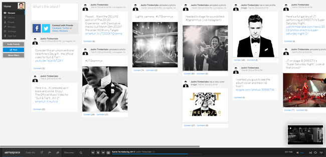
The new Myspace is now more focused on music rather than social media. This can be seen in many aspects of Myspace. First off, in the way you search for others, and also in which features are readily available. When searching around Myspace, you are presented with music artists before you are presented with your best friend you were searching for. Instead of a social feature readily available, you’ll find an audio player. The audio player allows you to enjoy interest based radio plus artists and playlists of specific songs you enjoy.
The New Design

The new Myspace is now horizontal, rather than the vertical layout that we are normally used to. In this new design layout, we also have a couple of new design additions to Myspace. First off, there is now a cover photo, similar to what we are used to with Facebook. However, the Myspace one is a bit larger – well, a “bit” is an understatement.
Interacting with Others
One of Myspace’s pitfalls is how it allows users to interact with others. No more are individuals considered friends on Myspace, now you are both considered connections on the social network. While this word may more accurately describe the relationship many social media users have with their “friends”, it more over shows how Myspace handles interactions on the website. When you make a connection, you are subscribing more to their content rather than becoming their friend – meaning that even artists you connect with on Myspace fall under the same “friend-like” category.
Final Thoughts
Overall, I feel that the new Myspace hopes to be an improved Spotify rather than a new Facebook. Sadly, this is due to how Myspace knows they can’t compete with Facebook at the moment. Even if they could, it’s namesake has tarnished Myspace’s reputation to achieve the level it once held a couple of years back. Despite a design with much potential, I feel that the new Myspace missed a note.
Disclosure: We might earn commission from qualifying purchases. The commission help keep the rest of my content free, so thank you!


