We have been witnessing the war of design and features between Facebook and Twitter for the past few years, looking only at the mentions and hashtags and trending topics, to name a few. One thing that remains distinct between the two social networking sites is the design. But even that is going to change soon.
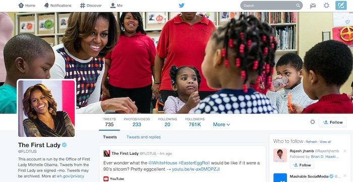
Twitter has unveiled a new photo-centric look this week to let users run a bigger profile picture, personalize the header (aka cover photo), and display what they consider to be their best Tweets. What’s new? Basically nothing, if you are also using Facebook. The resemblance to Facebook’s timeline design is just too blatant you would almost believe there is no longer any variation between them these days.
Read also: Watch out Facebook Home, Twitter acquires Cover
The new profile design will allow people to filter their search through others’ pages in order to locate specific Tweets, replies, and Tweets with photos and videos. The rip-off issue aside, there are a good few strong points of the Twitter redesign: it solves the perennial problem of most users who often miss important updates from users they follow without actually knowing what they have failed to catch. The existing and soon-to-be-legacy design constantly floods your home page with hundreds of new Tweets if you are following a great number of public figures or celebrities.
When I was using Twitter in the past (disclosure: I have deleted my account), the constant rush of updates always overwhelmed me. So I reduced the number of users that I followed. For newcomers, it would have certainly been an invitation to stay away from Twitter then. With the redesign, the popular Tweets – those that get the most replies and got retweeted by several other users – will take on a larger space on the profile page for new users to learn your most highlighted Tweets. This feature effectively subverts the old-style reverse-chronological display of Tweets, making them easier to locate on your cluttered page.

Twitter is rolling out the new profile pages to selected users as of now and newcomers will get the new profile look as well after registration. The micro-blogging site promises, nonetheless, to make the fresh look available to all users in the next few weeks. Unfortunately for mobile addicts, the new profile is not applicable yet to Twitter’s mobile app, which is a bit strange considering the massive shift toward mobile devices at present and given the larger number of users who access Twitter via smartphones and tablets than those who use desktop computers.
Disclosure: We might earn commission from qualifying purchases. The commission help keep the rest of my content free, so thank you!


