The design of an application is directly related to how the application is received by the user. Software design is separated into two fields, the aesthetic aspect of user interface and the emotional aspect of user experience.
This means that an application that looks stunning (user interface) is worthless if the user looses interest after a day or two (user experience and engagement). Because of this, the designer’s job, responsibility, and respect is sometimes underrepresented and appreciated. Apple’s Design Award from WWDC 2013 hopes to change this by giving recognition to amazing application designs published on the App Store. Here are the winners.
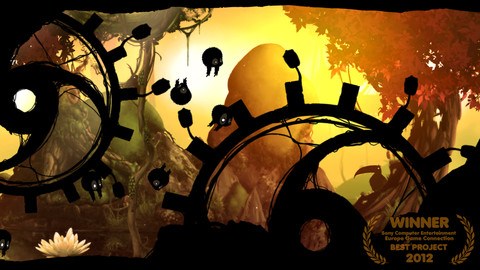
Badland

In this game, the object of the game is the figure out why, in such a beautiful forest, does there seem to be something that is a bit wrong. You must figure out where the problem lies and try to fix the problem. However, this would be too easy to do, right? That’s why you will have a couple of obstacles thrown in to get in your way. What’s a game without them!
Coda 2
Coda, and more specifically with the recent invent of Coda 2, web development is simplified and more organized. Developers are able to edit and even perform autocomplete on coding text when writing out your code, and it’s simplified and streamline design allows you to focus on the work at hand and not the surrounding UI. This makes the design award-winning in and of itself.
Evernote 5
Evernote is a life saver for most individuals. The note-taking application for just about every platform out there does much more than allow you to make notes to yourself. The application allows you to clip links from the web, take photo notes (especially with the partnership with Moleskine),and much more. The new UI for iOS is centralized by a design reminiscent of a filing cabinet, allowing you to stay better organized when navigating.
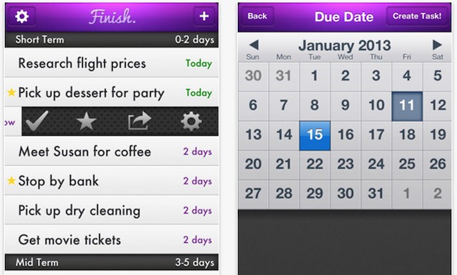
Finish *

Finish is a task manager that reduces the risk of having your other looming tasks from becoming a distraction for what you have to get done. This is done by hiding tasks that need to be completed at a much later date, alerting you of what needs to get done now, and preventing you from having incomplete tasks or tasks that run past their due date. Task entry is simple and without any muss or fuss. Finish will do the rest for you, in that it will separate your tasks in three categories (short, mid, and long term).
Letterpress
Letterpress is an addictive game in which participants must use the 25 letters at hand to spell a word that hasn’t been used yet in your game. When you use a letter, the letter turns blue, when your partner uses a letter is turns red. When the letter is used more than once by the letter’s “owner” it turns into a darker shade of (red or blue). This means two tries of the same letter by the opposing player is enough to steal back the letter. When letters are taken up, you earn points!
Mosaic.io *
Like a mosaic, which is a bigger picture made up of smaller pieces, Mosaic.io does the same thing. Using multiple iPhones, you can display an image on a much larger scale, similar to a computer with multiple monitors. To start, all you have to do is have two or more iPhones running the app. Just slide the image, in the app, over to the iPhone running the app. It will then expand across both (or more) iPhones.
Procreate
Procreate’s silica engine hopes and succeeds in making iPad painting as realistic as possible. For this reason, this application is a favorite for many artists with iPads. There are also multiple brush sizes, color options, and much for. For $4.99, the application is seen as a great deal with amazing quality.
Ridiculous Fishing
Using multiple tools, your mission is to go around your arcade world in an attempt to capture as many fish as possible. Once the fish have been captured, you’ll use guns to remove the gills. Yes, it may seem a bit extreme, but this game isn’t called Ridiculous Fishing for nothing. The unique and attention grabbing design and endless game play makes the $2.99 app worth every penny.
SkyGamblers
Your mission is to protect you assigned cities at all costs. Some of your responsibilities can include bombing enemy cities and even flying through small spaces. The game won the award due to its stunning and highly realistic graphics. Plus, the use of real locations like Pearl Harbor offers the user with an experience that is familiar to them. If you want fun action, this is the air combat game for you.
WWF Together
WWF stands for Worldwide Fund for Nature, which is an organization that works on animal protection and wildlife preservation. WWF has now created an educational application that helps users become more informed on the plight of the locations and animals WWF is protecting, including the giant panda that graces the organization’s logo. From interesting facts to fun activities, WWF Together is the application to help you become a more informed world citizen.
Yahoo! Weather
Minimalism in general is a trend that is being taken up by many individuals looking to free their life. Minimalism in applications is common, but more specifically common in weather applications for some reason. The ability to get the weather’s conditions in a snap, without also figuring out all the extra information is what many developers are working toward to keep things minimal. Yahoo! Weather achieves this very well, making use of clean text and simple photos (from Flickr) to offer current location weather conditions.
(*) Denotes applications that are made by student developers.
Let us know in the comments below which app has the best design from above. Yahoo! Weather takes the cake in my opinion.


