As we mentioned earlier in the week, there are many aspects of iOS 6 that withdrew aspects of iOS 5 and before. Some of these aspects include Google Maps and YouTube. These two popular services were removed from iOS 6 due to disputes over agreements involving revenue.
While very minor aspects of YouTube are available, including the ability to upload using the Camera app and iMovie, the majority of YouTube features are gone. One solution to this is by replacing the original YouTube app with the official YouTube app in the App Store. Today, we will give a review of the application and decide whether it’s a viable solution.
Interface
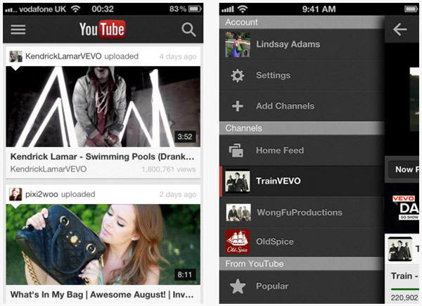
The app has an interface that is more reflective of the desktop version, rather than the version we expect from the original YouTube app. This is a good thing because what comes with it is more features. When launched, you are presented with the home screen that includes featured videos. The top shows the YouTube logo, with the right giving you a search option, left has an extended menu option.
When opening the extended options, you are presented with your account information, account settings, and the ability to sign into another account. Below this, in the extended column, you can view your feed and add more channels that you enjoy watching. The search option is well developed, with voice search and auto complete options.

Viewing Experience
I have to say, the viewing experience on the YouTube app exceeds the original. When you are clicking on a video to view more information, simply rotate to get the video in full screen. Rotate back to view comments and other info. You can share, thumbs down, or thumbs up all from the full screen mode.
Sharing and Interaction
When looking closely at sharing features, you have the ability to share a video on Google+, Twitter, Facebook, through email, messaging, as well as saving to Clipboard. When wanting to interact more with a video you are watching, you have the ability to add it to your “Watch Later” queue, add to favorites, a specific playlist, as well as flagging inappropriate videos. On a video screen, you have the ability to navigate between three pages. There is “Now Playing”, “Suggested” videos, and comments.
Recommended Adjustments
Even though this is a mobile app, you can’t escape the advertisements. This can be a bit annoying, especially for individuals with tiered data plans. Data is the ever more valuable on mobile phones, and having a good chunk eaten up by ads isn’t something many users would like to see.
If you find yourself experiencing a great number of apps, you may find temporarily switching to Safari on your iOS device as a great alternative. However, this is a great alternative to the missing YouTube app in any way. Google or at least Apple should provide more ways of promoting the application if Google truly wants to benefit from these ads (revenue wise) and consumer wise in allowing users to still enjoy YouTube.
What I Love?
Regardless, I love how the YouTube app is very streamline and more similar to the website version. It is a very modern look and very favorable on the user experience. The two main things users make use of during a video is sharing and rating, these are two things readily available in a video, great job on Google’s part! Lastly, the voice search feature is a nice touch.
Are we better off with the official app than the original? In a way, I think so. The advertisement nuisance is minimal and the renewed interface makes up thrice-fold for it. Plus, it’s still free, and that’s something anyone will love to see.
Download YouTube app for iOS today.


